by ZebSadiq
18. October 2010 19:29
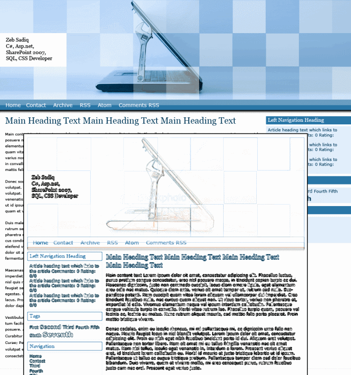
Earlier this year, I planned, designed and built a custom UI for my blog. This was an exercise to test and renew my creative skills. Since the build, I have been noticing areas where my initial design lacks and design elements which can be improved.
The biggest area which I thought needed improving was the blog’s width. I felt that the prior design was far too narrow for a technical blog. I also wanted to make the text easier to read since the text size of the initial design was far too small. Therefore I decided to re-design some elements of the design to make it more user friendly. As part of my planning, I decided to look into how I could use blueprint css to make the design and build process smoother and more standardised. I found that by using blueprint css, I could save time and effort and lay down solid foundations for future UI development. I decided to make the blog wider, easier to read and based it on blueprint css’s 24 column layout.
The whole process turned out to be a lot easier than expected. I wanted to keep elements of the old design while restructuring the foundation. Starting with the template psd file available from the blueprint css site, I imported the layers from my previous design. After I had resized the various layers, I was ready to start cutting some html. Within hours, the new design was finished and tested.
A lesson from my second iteration was that if I had looked into blueprint css during the first iteration, I could have ended up with a better design the first time round. I guess that's something professional designers have more practice with.
